Search This Blog

Friday, June 29, 2012

Yamaha Synth Arp & Drum Pad Review

I'm a pretty big fan of Propellerheads' Figure for making quick and simple tunes on my iPhone or iPad (it has an Android release too). I will get round to writing a review at some point for it, but meanwhile, I had high hopes when I saw a Twitter post from the lovely people at Computer Music mag announcing Yamaha's new iPad app: Synth Arp & Drum Pad.

I was hoping that it would be simple enough to get pretty quickly, but have a few more options than Figure does - particularly when it came to creating and saving songs.

At this point, I should say that I've been sucked into music applications and apps since 1997 when I got my hands on a beta tool that would turn into Propellerheads' ReBirth. I've enjoyed using a few, but too many times been frustrated at how complex some of these applications could be. The birth of the tablet offered hope of a quick and easy music creation experience with touch.

The blurb on iTunes sounded good:

Synth Arp & Drum Pad is an iPad app with arpeggiator and drum pad that allows you to easily play the internal synthesizer or any connected MIDI device and produce music with phrases having an abundant variety of musical styles.
(The arpeggiator automatically plays the individual notes of a chord in a selected pattern.)

There are 342 arppegiator patterns that can play phrases from all kinds of music genres like dance music, hip-hop, rock, pops, with one finger.

I love arppegiators. Don't know how much of my life has gone in fiddling with them, but to have 342! Awesome!

The screen shots looked good too:


It looked like a good balance of synth parts and a programmable drum machine

Would Synth Arp & Drum Pad be that killer combination of easiness combined with power?

It started well. The arppegiator is great. You can lock the link between the voice and the arp sequences, or you can break the link and get some pretty wacky effects with the many voices included with the tool. I have to say, I spent a good hour just playing with all that and had a whale of a time!

The tricky bit came to the adjustments. For a start the touch sensitivity is woeful. When you turn the effect pots there is a noticeable lag, making real time or sensitive adjustments pretty much impossible. Transitioning notes during the arp sequences to create chord variations is hit and miss too. I found horrible missed cuts, even with quantization on, as the touch sensitivity just lagged behind.


Once you do get an adjustment going and hit the right notes at the right time you can make some killer leads and bases. Yamaha have put at lot of thought into the arp sequences, and as I said before, the voices are all pretty good.


On to the drum machine screen.


Again, started well. Nice array of sixteen pads. Bashing some of the demo notes revealed some good sounds. On with the programming. And here another hour was lost. But instead of a joyful hour, it was an hour of frustration trying to make the damn thing do what I wanted it to do.

OK - at this point I must point out my drum machine history. Roland. Sorry, it just doesn't get any better and I've never seen a reason to change my view on that. The TB sequencing and step sequencing come natural to me. Yamaha's interface didn't.

Now it might be me. it might be the Korg guys and the Yamaha guys, and even you Roland people out there, just get this interface and make beautiful patterns. I just didn't get it. The manual is rubbish, and was no real help.

You can assign a pad to be a sequence or a hit. The yellow ones in the picture above are sequences. Take a lot at the screenshot below:


When you edit a pad with a Seq that is what you see. The notation is flamming MIDI. I'm sorry, I'm sure lots of people like that, but as a Roland guy I like "House Bass" or "Techno Kick" and I like to rename them if I want to. And I know I can rename them in the Pad Edit bit. But seeing "C1" just means I have to muck about figuring what type of sound "C1" actually is. Life's too short...


The bars below are where the hit occurs in the 16 step sequencer. Just try getting that to work easily. You can see my pathetic attempt on the end of the bar to do a rolling kick. I just couldn't get the levels right and got fed up.


The final kick in the teeth was the measure panel. I thought I could edit each measure so that in four bars I could add variation. Nope. It is an indication of when the sounds are triggering. if you deselect 1,2,3 then the sounds only fire in bar 4. So if you want so variation between bars that has to be done on another pad. Grrr....


So would Synth Arp & Drum Pad be that killer combination of easiness combined with power?


Frankly - no

Sorry Yamaha. I'm sure this may turn out to be a great app, and probably is for some people, but just not for me.

I realise I haven't touched on other aspects of this app, but I got fed up with it. I love the arps, and will probably sample them or use them with another app in some way. The interface is not for me, and the drum machine is - well - pants.

Of course, this is my opinion. What do you think? Is it right up your street? Or do you agree with me?

Tuesday, June 26, 2012

Alternatives to Thinkfuse.com

Our organisation uses Thinkfuse.com, or rather, it did until the founders sold the company to SalesForce. Whilst they are "excited" about this news (whilst pocketing a few quid no doubt), it does leave those of us using their technology - well - a bit buggered.

You see, they are discontinuing the service. As soon as the calendar hits 25th July, 2012, they will wipe out the data. Lord knows why SalesForce doesn't want to keep the data, and just keep the service going, but it doesn't. So we are in a bit of a pickle.

Having looked for alternatives, I was quite shocked at how few there are on the market. Thinkfuse is so simple, so laughably simple, that I would have thought there would be loads of alternatives. It is basically a fairly poor web editor where you write up a report every week for your manager. You get some reminder emails, and the manager gets a nice dashboard to view your reports. Well, a simple dashboard at any rate.

If I were Theo on Dragon's Den, I'd be thinking "barrier to entry - zero - I'm out...". But it seems this market has passed by many web types. There are lots of heavy weight online tools out there, which have status reporting as part of projects, but not many that have team status updates.

Here's some I have found:

http://www.weeklydebrief.com/


This seems to be a recent tool, and is currently running in beta. This means it's free to sign up, although once it exits beta it will be a paid for service.

There is a short video tour that shows you around the product.

It is different to Thinkfuse in that team members submit their reports via email (in Thinkfuse there is a web-based interface to do this). Two emails are sent; one for "Things achieved" and a second for "Things planned". This many be a good way for your team to do this, if they are wedded to email, but if you are trying to encourage more collaborative tools, perhaps it's not for you.

The manager can then view a rather nice PDF report, that really looks quite flashy. It would certainly be very good to forward on to senior management "as is".
Of course, getting it to look that good for you will need nice photos of your team (tough if you run a development team) and a bit of design flair. Still, it's a good thing to have.

There are also iPhone and iPad interfaces if that floats your boat, as well as standard web interfaces.

http://www.simple-status.com/

This site is a bit more organised than Thinkfuse and Weeklydebrief. Employees are encouraged to organise their activities into categories, shown in the screen shot below:
As you can see, there are Goals, Tasks and Accomplishments. You can add your company's logo to the dashboard, as set preferences to see the information how it best suits you.

It's not too clear on the website how it works, but it appears that status reports are centred around the information in these three categories.

Again, different from the more freestyle entry in Thinkfuse, but may suit some better.

There is a short video to watch, to try and glean more information.

This is also in beta, which means it's free but is limited to 10 users in a team. It will convert to a paid for service at some point.

http://www.15five.com

If you scan to the comments below, you can see Shane  @ 15five got in touch suggesting his company's product. I checked out their website, and it didn't help me much, but have found some good reviews on the web which helped figure the product out.

15five is based on a simple concept; it should take team members up to 15 minutes to write their report and a manager 5 minutes to read it. The manager assigns questions which can be one line answer, multi line answers and so on. The employee gets an email notification and fills in the report on the web. The manager has a dashboard and can then review them.


There is an emphasis in hierarchies too. So in our example, once the manager gets his reports, he can submit a report to his director, who then submits his report to the CEO. That's quite a neat idea.

There is a 4 week trial period and the price is $99 a month for up to 20 employees.


For more information check out an thorough report over at appstorm and also an article from a real-life user over on the Inc. website. Also, email Shane who I'm sure would be happy to help out.

http://www.teamly.com

Many thanks to Scott who posted a comment telling me about his solution over at teamly.com.

Teamly gets you to enter your top 5 daily, weekly and monthly priorities (great for fans of the Nick Hornby novel High Fidelity!). Managers can see all the priorities set. Comments can be recorded by both managers and their reports. Priorities can be made private.


There is an ability to mark priorities according to their status, so the manager can see what everyone is doing. There is some basic reporting packaged too. For a user workflow, check out http://teamly.com/tour. A video tour is available from the home page.

There is a free to use, ad supported option or to remove the ads and access some more features for $8/mth per user.

I can see this being a good solution for some, but for others, it could feel like micro-managing if a boss insists on daily goal setting. The red / amber / green colour coding might induce panic in some employees, which might be a good or a bad thing!!

A word on the website - it's good and the information is well laid out - but strangely no menu options are available from the home page. Click through into the tour, and you get menu options for the pricing, testimonials, etc.


Others

I was also asked to check out siasto. It doesn't have the greatest website in the world, and what was quite odd was that in one screenshot someone seemed to be sharing with their team that they were going to fire someone. I suspect this breaks several EU working laws!


Anyhow, the tool does appear to be very project-oriented, so probably not for us.

Someone also recommended workflowy. This is a real "marmite" tool - people either love it or hate it. It seems most suited to keeping personal lists and sharing with friends/colleagues, rather than sharing them within a team hierachy. If you like lists, take a look. If you like mindmaps - avoid. It's not suited to replacing Thinkfuse, in my view, but you may think different.

I did look at binfire, but it is far too project-oriented and I also took a brief look at estatusreports, but it is software and quite complex, so not a simple, online tool.


Conclusions

Initially I found two comparable services, but as this blog has been read other services have been suggested. There still isn't a like-for-like competitor. which still amazes me, considering how successful Thinkfuse was. Whilst Thinkfuse was great, it was pretty simple and very easy to replicate better than they did it. Now it has gone the way of the Dodo, there is room for a simple tool to replace it.

The market seems to want to focus on helping people organise their worklists, rather than allow a sort-of brain dump. As such, there aren't any like-for-like replacements I can recommend. You are best checking out the ones above you think might be interesting and exploring from there, recognising they all force some kind of structured thinking.

Please let me know if you have any further alternatives. I'd love to hear about them!

N.B Company Websites

Small rant. Throughout this investigation, I have been amazed at how poor some of these websites were. All I wanted was some screenshots, some words on the features, maybe a short video, a pricing plan and a link to some reviews or testimonials. Only weeklydebrief and teamly actually had this (and teamly's is hidden!). The rest required looking for reviews on Google, or trying to work out from other articles how the thing worked. The websites were mainly moody photos and little content, insisting your signed up to see more.

Not everyone wants to sign up for a free trial just to see how a solution works!

Rant over...

Friday, August 26, 2011

Ripping your DVDs and Blu Rays pt.2: Extract Subtitles for M4V / MP4 / iTunes

UPDATE March 2014

Handbrake (from version 0.9.9) will now burn subtitles direct from MKV containers ripped from Blu-Rays as the screen shot below shows:


But I've kept this post on, in case you are using an older version of Handbrake.

Also, for the record, BDSuptoSub can be run on OSX - but you need to install the OSX Java engine
------------------------------------------

In a previous post, I covered the method I use to rip DVDs and Blu Rays for use in iTunes and iOS products (check out the article here if you missed it).

To recap the tools I have:

I have been trying for sometime to find a way, using my Mac, of carrying subtitles over from Blu Ray discs onto these ripped M4V files.

(BTW, Windows users, the following software all comes with Windows versions - so you should be fine to follow this summary described below.)

Often films contain "forced subtitles". These are for when a film in English language has dialogue spoken in a another language, and forced subtitles translate just these small sections rather than the whole film.

They are called "forced" because they play back as default on DVD and Blu Ray players. Trouble is getting them to do the same on your ripped copies.

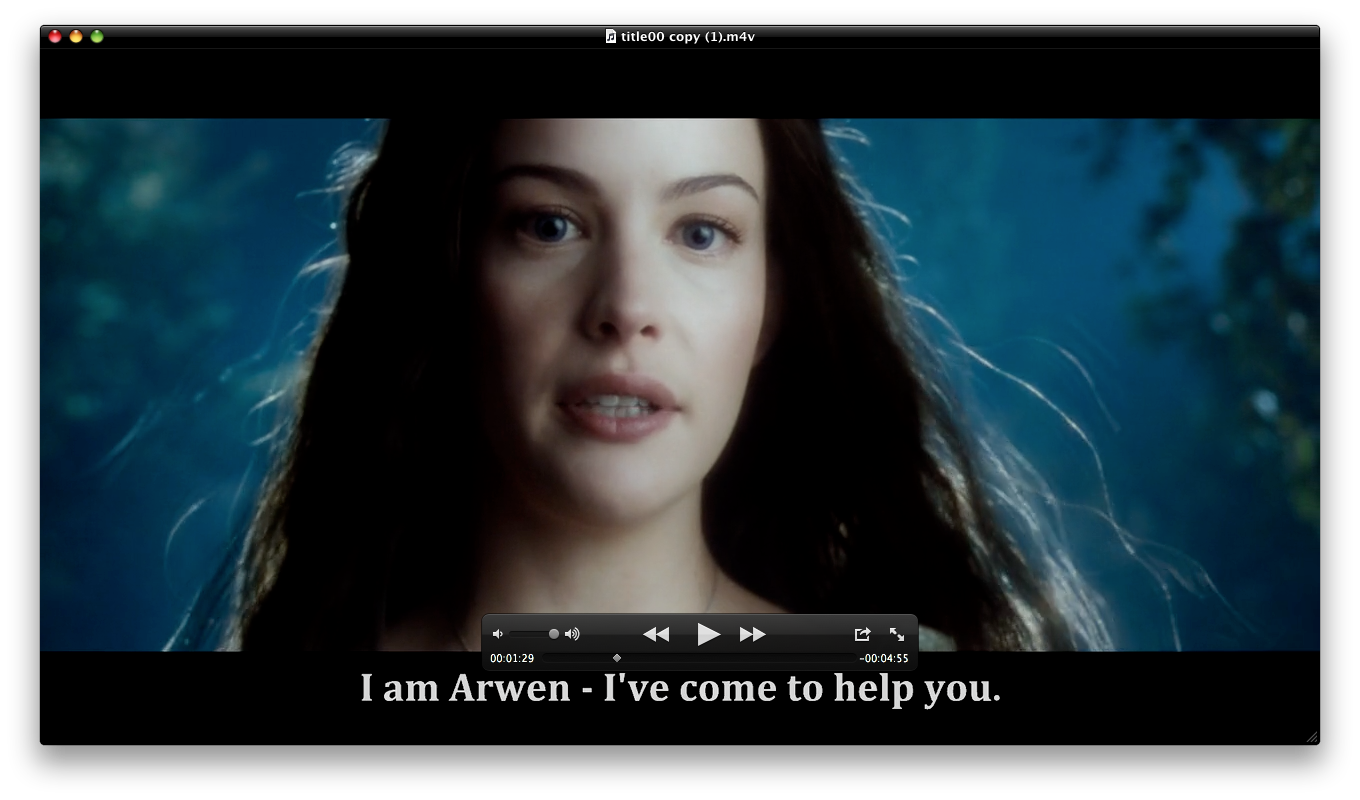
As an example, the Lord Of The Rings trilogy of films have sections spoken  in Elvish for which there are subtitles provided. This has been the catalyst for this investigation, as I really wanted those movies for my iPad.

The method described below also works for full subtitle tracks  - especially useful for me for the Millenium trilogy of films where I like to have the original Swedish soundtrack, and have English subtitles.

Obviously, if you are hard of hearing, this is going to be of great interest too for all your Blu Ray ripping.

DVD

DVD is simple, and can easily be done in Handbrake. As you can see in the example below, this DVD of 101 Dalmatians has subtitle tracks recognised by Handbrake.


All you do is

  • Select the right language
  • Check the "Burned In" box
  • Check the "Forced Only" if you want just forced subtitles, or leave it blank if you want all the dialogue subtitled.
That's it.

Blu Ray

Blu Ray is MUCH harder. This is because the Blu Ray format of subtitles are bitmaps, and as such, as not supported by many editing tools - Handbrake included. To witness The Lord Of The Rings in true HD glory and understand that Elvish dialogue, we are going to need to get some more software:
As an aside, this method may be long-winded, and there could be a simpler way to do it - I'm not perfect! So if there is, let me know! It took a lot of research through various forums....

OK, so we will assume you have a nice MKV file of your Blu Ray with all the audio and subtitle options on it that you need.

MKVTools

(1) Open MKVTools and open your MKV file.

(2) Navigate to the "Edit" Tab and choose the subtitle track you want to export (I know the Elvish to English translation for this Lord Of The Rings rip is Track 2). If you aren't sure, open the MKV is something like VLC Player and fiddle with turning on the different subtitle tracks until you find the one you want, then go back into MKVTools.

(3) Check the "Extract Selected Tracks" box on the right and click "OK". Another window will open and you will see the progress of the file extraction. It will store the subsequent SUP file in the same folder as you MKV file.

BDSupToSub

You will now need a Windows machine, or an emulator on your Mac running the BDSupToSub software.

I have searched high and low for a Mac native equivalent and draw a blank. Again, if you find one, let me know.

(1) Open BDSupToSub and load in your SUP file.

(2) Just leave the Conversion options as they are (the resolution should be 1920x1280 as this is the Blu Ray default).

(3) You will get a nice screen showing you the first subtitle line found. You don't need to do anything with this, just go into File / Save/Export and click OK (changing the language marker if needed).

You will have two files; a SUB file and a IDX file.

MKVToolNix

Back to the Mac environment now, and you need to open up the MKVToolNix tool.

(1) Click the "add" button to add your original MKV file and your new IDX file (make sure the SUB file is in the same folder or it will throw an error).

(2) Scroll down the "Tracks, chapters and tags" box until you see the VobSub entry at the bottom. This is your subtitle track. Check that box and uncheck all the other subtitles.

(3) Name the new MKV "Output filename" and hit the "Start muxing" button and wait patiently....

Handbrake

Now you have your new MKV, open it in Handbrake and check the subtitles tab - you should now see a VOBSUB file that Handbrake understands. 


Set your options and off you go! Your output should look like this:

And there you have it.

Not too complex, just a lot of faffing about with different bits of software.

I'm sure paid for software does this out of the box. Actually, I'm not sure! It might not!

Thursday, August 25, 2011

KeepVid.com Review: Download and Keep YouTube, MP4 and other media

KeepVid.com is a little gem that I need to share. I have tried plenty of freeware programmes in the past for downloading YouTube videos, but KeepVid.com really is the best.

And it is totally FREE!!

It's pretty simple:

(1) Go to keepvid.com


(2) Type in the URL of the video you want to download (or you can search within the same box). It might ask you permission to load the Java application, in which case allow it yo do so.

(3) Choose the format which you want to download it in

(4) Click on it and off you go!

You will need to have Java installed (which you can get via your browser or at java.com) but it's cross-platform (works on Windows, OSX, whatever).

You download a program should you wish to, and thus contribute to the site, and if you use it a lot it might be nice to "give something back" via this route. I personally prefer the web service route, and perhaps the authors will consider putting a donate button on the front page?

They list all the sites they currently in their FAQ and it is pretty comprehensive.

So ditch the freeware, that might well be more malware than anything else, and use this excellent free service.

Friday, August 19, 2011

Neuroshima Hex! iPad and iPhone Game Review

An operation and subsequent lay off from work has meant I have had time to do some things I don't normally get time to do. I have watched a lot of movies that everyone else has seen and I haven't; I have made a serious dent in ripping my DVD collection onto iTunes and I have played games on my iPad.

My son enjoys a good game of Monopoly, so we downloaded and played that for a bit. The same publisher also did Risk, which I have loved since a kid, so a few hours were spent playing that. Then iTunes Genius recommended Neuroshima Hex! and the recovery days have flown by.


So what is it? It's a turn-based board game of the world domination genre set in a post-apocalyptic future world of war machines, mutants and mankind locked in a battle for land and resources. As always with these things, he who survives and destroys his opponents wins the game.

There are six armies to choose (four come with the game, and two are available via an in-game purchase). Each has it's own strengths and weaknesses, and your preferences will be based on how you like to play.

I have to say it is much more complex than the likes of Risk, and the phrase "Read The Manual" is very relevant for this game. I'll try and summarise the basics here.

Each player starts with a HQ that has 20 hit points. The goal of the game is to either destroy your enemy's HQ, or take less damage during the game than them. The game takes place on a hexagonal board, which you can see pictured below:


Each player also starts with 35 "tiles" that are split into several types:

  • HQ - The Headquarters that must be defended whilst you attack your opponents.
  • Board Tile Unit - the armies of your campaign. These attack opponents tiles on the board.
  • Board Tile Modules - give your Unit tiles special abilities, such as increasing attack strength or Initiative (more on this later)
  • Instant Action Tiles - provides an instant hit, such as destroying an enemy tile or allowing you to move one of your own to another hex

Each player gets dealt three tiles, of which he must discard one. Two are then used and either placed on the board (if they are Board Tiles) or used as an Instant Action. Players take it is turn to place or use tiles until one of two things occurs; the board is full or a player uses a Battle Instant Action. The battle stage begins, and this is where Initiatives are used.

Each piece has a number marked on them and this is the turn in which they act - the higher the number the earlier in the battle you act and so you get the jump on your enemies by destroying their pieces before they destroy yours. So using a module to increase your Initiative or decrease your enemies is a good tactic.

Different units have different abilities. They can shoot in multiple directions or multiple times (or both!), or use a net to disable an enemy or have armour to defend against attacks. Generally the more powerful a piece, the lower it's Initiative, and this adds an interesting dynamic to the strategy.

Let Battle Commence!
Up to four players can play in a game (either human or AI), but only on the iOS device - although the publishers are promising Internet play at a future stage. There is integration with Game Center, and there are plenty of trophies to aim for.


The game itself is incredibly addictive. There is a steep learning curve, though, and I advise reading the manual included in the game from start to finish (it doesn't take long), studying the armies catalogue and then plunging in for a two player game against the AI on Easy level.

This tutorial from the publishers will give you a good overview of how it works:


It doesn't matter which army you choose to start with, I found my early successes came with the Outpost, but play a few games and see how you get on.

Some people are recommending playing the puzzle version of the game, Neuroshima Hex Puzzle,  to learn it better, but I haven't played that (saving it for a long plane journey) so I can't say one way of the other. I enjoyed the learning curve, and am still finding new ways to set up units against different enemies.

There is an element of luck, getting the right tiles at the right time, but that doesn't overly affect the gameplay as you may have to battle back from a bad start, which is a challenge in it's own way.

With the addition of Internet play, and new expansion packs promised, this is a bargain for £2.99 considering the board game retails at closer to £40 and you have to work out all the attacks and defenses yourself - which can be pretty complex! The two new armies (£1.49 each) add new dimensions, and are worth a purchase when you have mastered the four provided.

Find out more by visiting the publisher's website: http://www.neuroshimahex.com/


Tuesday, July 5, 2011

BlackBerry PlayBook Review - 1 month in...

I have an iMac, a Sony Vaio laptop, an iPod Classic, an iPhone and an iPad. These are my personal productivity and consumption items for when I'm watching movies, listening to music or, indeed, writing this blog.

But my workplace is wall to wall BlackBerry and as such I have a BlackBerry Bold 9780 as my smartphone and am now road testing a BlackBerry PlayBook on behalf of the company. I've had it a month, so thought it might be a good opportunity to reflect a little on it's performance, particularly compared to the iPad

BlackBerry PlayBook image from RIM
Look & Feel
I'm not going to provide an exhaustive list of stats here, for those who want that kind of stuff and wooshy marketing videos, head over to the BlackBerry website. Suffice to say that it is smaller than an iPad, at around 7", but still feels as heavy as one. You can't hold it in portrait mode at the bottom like you can a Kindle as you start to feel the weight pull and it quickly becomes uncomfortable.

Also, in a major blunder, BlackBerry have made it a tad too big to fit into a suit jacket pocket. When I confronted RIM about this, they shrugged it off, but everyone I have spoken to has agreed it is a major design flaw and reprehensible that no-one at RIM thought of this. Where it could have scored a point over an iPad was having it more accessible and portable, but because of those few millimetres, it has to be carried by hand or in a bag like an iPad.

It feels a solid piece of kit, and is made of good quality materials. The anti-slip covering on the back divides opinions. Some don't think it feels right, whereas others think it gives a good feel. I personally like it, and it feels less prone to spinning around or off a table like an iPad can (and if you don't frequently spin your iPad around, try having small children make a grab for it whilst on the kitchen table and watch that sucker spin!).

Screen & Sound
The screen is fantastic. The demo video bundled with the PlayBook looks almost 3D and the sound from the stereo front speakers in clear and not at all "tinny". Loading up some more realistic test videos taken on an iPhone 4 in 720p and the screen copes admirably. So for watching movies and viewing pictures it's pretty good.

Like the iPad, the screen is highly reflective - possibly even more so than the Apple device. The finger prints are a real issue too, and the table requires frequent wiping. Perhaps it's the smaller screen estate, but it feels like it gets dirtier quicker than the iPad.

What is not as good by a long way is the touch sensitivity. Ladies with long finger nails beware - you have to give it a really good jab as the minimised contact area due to those lovely nails often renders the PlayBook immobile. Even for stubby fingered individuals, the screen can be unresponsive requiring a good push and big sweep. Apple really do do this well, and RIM have not got this quite in the same league.

Switching between portrait and landscape is a lesson in patience. The quickest it moves is about 2-3 seconds. Sometime it doesn't change at all. Sometimes it flips upside down randomly. Sometimes half the screen is black, the other half rotated. It's all odd, and all very buggy and very frustrating...

Even RIM can't get the damn thing to rotate into portrait!


Apps
Unlike the hundreds of thousands of apps on the iTunes store, there are only a few thousand if that on the PlayBook. New apps are emerging all the time, but the bundled apps are few and there isn't much choice beyond them.

You get icons for Twitter, Gmail and Yahoo but these are just weblinks that launch the browser. A new Facebook app has just appeared, and that is quite good, but these almost essential apps missing is poor.

The bundled games of Tetris and Need For Speed are good, and will keep the kids amused for a while.

The Documents To Go suite is included, but unfortunately, is virtually unusable. I've used alpha software that is less buggy. It frequently crashes necessitating a hard reset, doesn't save documents and is generally a nightmare. When it's going, it has some nice features and is probably a richer interface than Pages on the iPad. But Pages is a nicer user experience, and hasn't crashed on me once!

The Adobe Reader app is OK. It is an equivalent of Preview on OSX or the preview app on iOS, in that it is not functionally very rich. It doesn't keep zoom levels when you turn pages in the document, the magnification goes grainy quickly and you can't share via email through the user interface. Again, take your pick of better apps on iTunes (I'm a Good Reader fan), but a quick scan on BlackBerry World revealed very little 3rd party options.

The mutli-tasking aspect is good, and I like being able to spin through small screens of the apps that are running. They aren't just screenshots either, movies continue to play whilst "minimised" in this app "ribbon". RIM make a big deal of this, but honestly, who would want a movie to be still playing whilst you are doing something else?! It can be difficult to swipe across and land on the app you are looking to maximise. I keep missing, requiring tiny little prods to go backwards or forwards slightly. Again, the gesture interface is behind the iOS devices here.

Interface for navigating through apps in nice, but it can be tricky to hit the right one


Browser - and the much hailed Flash Support
The advertising from RIM has accentuated the fact that the browser can support Flash. I find the lack of flash on iOS cause me very little inconvenience. There aren't really any of the 10 or so sites I go to 80% of the time (Amazon, eBay, BBC, The Register, Wikipedia...) that don't work on iOS. It's only if I go off the beaten track, to a hotel website or something, where I occasionally come across Flash.

So I booted up the browser in PlayBook and tried a few sites. The curse of the PlayBook bugs struck again, and my Dad's art website that has Flash all over it sometimes rendered and sometimes didn't. Other sites I found to have similar issues. So yes it does support Flash, but the bugs in the browser mean you get to know the hard reset command real quick!

What is nice if that if you are connected through the BlackBerry Bridge and are surfing the Internet on a train where the mobile signal can fade in and out, the browser pauses downloading pages and waits for the signal to reconnect before carrying on. Apple take note - no annoying messages about signal availability and then a blank browser! This is really neat and makes commuting and surfing a pleasure.

HARD REST - Hold down Vol Up, Vol Down and Power!!!

BlackBerry Bridge
Is it a consumer device, is it a business device. RIM tell me it's both. This is a mistake, they should target one or the other. The business techies don't like the fact you can't encrypt the flash drive (you can in iOS using enterprise tooling), don't like the fact it only has HDMI out (I know of no company whose presentation suites accept an HDMI connection) or the fact you can download any number of apps and they can do nothing about it.

Equally consumers will not be happy that the email application is only available when tied to a BlackBerry Smartphone. It's a bit of a faff, but you have to install BlackBerry Bridge on your BlackBerry phone, then turn on Bluetooth, then setup the PlayBook to talk to your phone.

I got it working after a few goes (again, bugs!) but it is not exactly stable. The longest I had it going was half an hour before the screen froze. In a meeting recently, I went to check my calendar and after two reboots and a bit fo swearing, apologised and opened it on my BlackBerry phone.

The Bridge PlayBook apps don't add much over the phone apps. Sure, they use the screen estate better, so Calendar opens in a week view, but there is no improvement in things like checking availability for booking meetings.

The icons are baffling at the bottom - they seemed to be designed so the user has to guess at what they do. I ended up randomly clicking a few to find out what they did in the end!

CONCLUSION
It's quite a nice device, but the bugs make it unusable. It is, at best, a beta product and I do not use it for business at present, because it is so unreliable. RIM have rushed out a product to market to compete with Apple, and risk losing their potential customers before they have even got going.

I have demo'd the device to about 10 senior managers in my company. All 10 of them preferred the Apple iPad. I'm sure this isn't scientific, but nonetheless I think RIM have got this really wrong.

BTW, my company is just starting to allow iOS devices onto the corporate network.

The beginning of the end for RIM???

Wednesday, June 15, 2011

Slow Login Time On Your Mac? Ditch the Cache!

In my previous post, I described a problem with iMovie. As part of the resolution, I trashed the Cache folder. I was amazed at how much faster the Mac logged in. Previously, it had taken up to 10 seconds or so to be useful from the Login screen - with the spinning colour wheel of doom furiously spinning away...

Well no more!

In speaking to Apple Support, the guy on the phone said he regularly trashes the Cache as all sorts of flotsam and jetsam builds up in it. Ironic when it is supposed to help speed things up!

After deleting mine the desktop arrived and was useful in about a second!

Much more acceptable for a latest generation iMac!!

My advice - if things are running a little slow - trash the Cache and see if it makes a difference...